An infographic isn't a blog post squeezed into one page.
It's one idea made easy to understand.
Instead of asking,
"What do I know?"
I'd ask,
"What's one thing I want someone to understand in less than a minute?"
The narrower your topic, the stronger your infographic usually becomes.
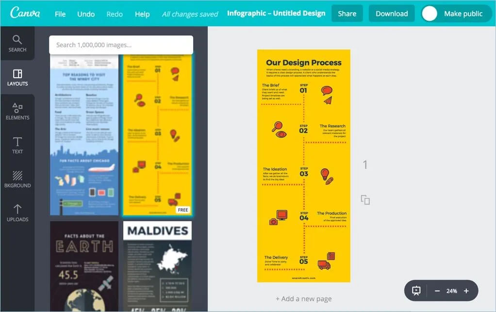
Research
A beautiful infographic with incorrect information is still... incorrect.
Before opening Canva or any design tool, spend time gathering reliable facts, statistics and examples from trustworthy sources.
I've learnt that people forgive simple design.
They rarely forgive misleading information.
Good research is what makes an infographic worth sharing.
Organize Information
Don't start designing yet.
Write everything on paper first.
Then remove anything that isn't essential.
I've noticed that the best infographics don't overwhelm you with information.
They guide your eyes naturally from one point to the next.
If every fact feels equally important, the reader won't know where to look first.
Plan Layout
This is something I always keep in mind.
People don't read infographics.
They scan them.
That's why your layout should feel like a story instead of a random collection of boxes.
Use headings, sections and enough white space so the reader can move through the information without feeling lost.
If someone has to figure out where to look next, the design isn't doing its job.
Add Icons & Charts
Not everything needs an illustration.
But whenever a simple icon or chart can replace a long sentence, I'd choose the visual every time.
Icons make information easier to recognize.
Charts make numbers easier to compare.
The goal isn't decorating the infographic.
It's helping people understand it faster.
Keep Text Concise
One habit that improved my infographics was asking,
"Can I say this in fewer words?"
Most of the time, the answer was yes.
An infographic isn't supposed to explain every detail.
It's supposed to highlight the most important ones.
If a paragraph feels necessary, it probably belongs in a blog instead.
Maintain Consistent Design
One colour palette.
One font family.
One icon style.
Consistency makes an infographic feel professional without anyone consciously noticing why.
When every section looks different, the design starts competing with the information.
The content should always be the hero.
Review
Before exporting, pretend you've never seen the infographic before.
Can you understand it in under a minute?
Are there spelling mistakes?
Do the numbers match your sources?
I've found that taking a short break before reviewing helps me notice mistakes I completely missed while designing.
Export
Once you're happy with the design, export it in a high-quality format that's suitable for where you'll publish it.
PNG usually works well for social media, while PDF is a better choice for presentations or printing.
The best infographic is the one that's easy for people to read, share and remember.
FAQs
How much text should an infographic have?
Less than you think. If people have to stop and read long paragraphs, it starts feeling like an article instead of an infographic.
Should I use charts in every infographic?
Only when they make the information easier to understand. If a chart doesn't add clarity, it's better to leave it out.
Why do some infographics look cluttered?
Usually because they try to include too much information. Removing unnecessary text often improves the design more than adding new elements.
Must Read: How to become a great graphic designer?