Asked 6 years ago

What color does mixing green and blue make?

0
911

Hey, help the community by sharing your answer.

Earn up to 300 points for helpful answers.

Login to Answer

Quick Answer

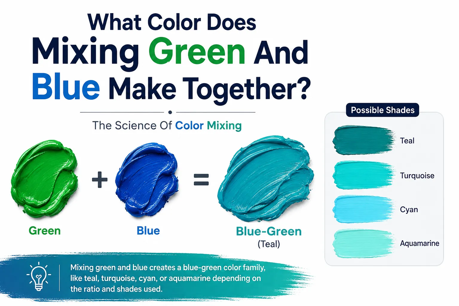
If you are mixing standard paint, combining blue and green creates a tertiary color known simply as blue-green. Depending on the exact ratios, the lightness, and the specific pigments used, this combination can yield beautiful shades of teal, turquoise, cyan, or aquamarine.

Because blue is a primary color and green is a secondary color (made from blue and yellow), mixing them together deepens the cool tones, resulting in oceanic and highly soothing hues.
Article image

In this guide you will learn:

  • Exactly what do the colors blue and green make in both paint and digital light.

  • How different mixing ratios create distinct shades like teal and cyan.

  • Expert tips for mixing these pigments on your canvas.

  • The psychological meaning behind blue-green colors.

The Science of Mixing: What Color Does Green and Blue Make?

If you have ever stared at a blank canvas and wondered, what color does green and blue make, the answer depends heavily on the medium you are using. Color theory behaves differently when dealing with physical pigments (paint) versus digital light (computer screens).

Subtractive Mixing (Paint and Pigments)

In traditional art, we use the RYB (Red, Yellow, Blue) color model. Blue is a primary color, meaning it cannot be created by mixing other colors. Green is a secondary color, created by mixing blue and yellow.

When you combine a primary color (blue) with a secondary color next to it on the color wheel (green), you get a tertiary color. In this case, you get blue-green. By adjusting the amount of white or black paint, you can turn this base blue-green into striking shades of turquoise or deep teal.

Additive Mixing (Digital Screens and Light)

When experimenting with digital design, you might ask: blue green make what color on a computer screen? Digital screens use the RGB (Red, Green, Blue) color model, where both blue and green are primary colors of light. When you overlap pure blue light and pure green light at 100% intensity, you create Cyan, a bright, vibrant, electric blue-green hue.

Shades and Ratios: Blue Green Make What Color?

For artists and designers asking, "green and blue makes what color when mixed unevenly?" the answer lies entirely in your ratios. Changing the balance of your mix will dramatically alter the final hue.

Here is a breakdown of the specific colors created by different ratios of blue and green:

Mixing Ratio

Dominant Undertone

Resulting Color Name

Best Used For

50% Blue + 50% Green

Perfectly balanced

Cyan / Standard Blue-Green

Bright tropical waters, digital accents

75% Blue + 25% Green

Deep, dark, and cool

Teal

Moody atmospheres, modern interior design

25% Blue + 75% Green

Vibrant, warm, and bright

Turquoise / Seafoam

Beach landscapes, energetic branding

50/50 Mix + White

Soft and pastel

Mint / Aquamarine

Spring palettes, calming backgrounds

Expert Tips for Mixing Blue and Green Paint

If you are working with physical acrylics, oils, or watercolors, mixing the perfect blue-green requires a bit of technique. Here are the best steps to achieve a flawless blend:

  • Start with the lighter color: Always put your green paint on the palette first. Because blue is a much darker and more overpowering pigment, it is easier to add small amounts of blue to green than trying to lighten a dark blue.
  • Add blue gradually: Mix in the blue pigment drop by drop. You will notice the green transforming into turquoise almost immediately.
  • Use white to test the hue: Blue-green can look incredibly dark on a palette. To see the true undertone of the color you just mixed, dab a tiny amount of it into some white paint. This will reveal if it is leaning too teal (blue) or too seafoam (green).
  • Mute with a complementary color: If your blue-green is too neon or unnatural for a landscape painting, add a microscopic touch of its complementary color (red or orange) to neutralize it into a natural, earthy ocean tone.

The Psychology of Blue-Green

Let’s explore exactly what do the colors blue and green make in terms of human psychology. Because this color family combines the serene, calming qualities of blue with the renewing, natural energy of green, blue-green hues are incredibly popular in design.

Colors like teal and cyan evoke feelings of tranquility, cleanliness, and emotional healing. This is why you frequently see these shades used in the medical field, spa branding, and modern technology interfaces.

Frequently Asked Questions (FAQ)

Is blue-green a primary, secondary, or tertiary color?
In traditional art and painting (the RYB color wheel), blue-green is a tertiary color because it is made by mixing a primary color (blue) with a secondary color (green).

What is the difference between teal and turquoise?
Teal contains a higher ratio of blue mixed with a tiny bit of black, making it a darker, richer color. Turquoise contains a higher ratio of green and is typically mixed with white, making it a brighter, more vibrant shade.

What color do blue, green, and yellow make?
Because green is already made of blue and yellow, adding extra yellow to a blue-green mix will simply pull the color back toward a yellow-green or lime green shade.

How do I make my blue-green darker without making it muddy?
Avoid using pure black, which can make colors look flat or muddy. Instead, to darken a blue-green mix, add a touch of dark navy blue (like Ultramarine) or a very deep purple to enrich the shadow.

Conclusion

Whether you are painting a vibrant ocean seascape, designing a digital logo, or simply exploring the wonders of color theory, the combination of blue and green is one of the most versatile mixes available. By adjusting your ratios, you can create an entire spectrum of breathtaking shades ranging from deep, moody teals to bright, electric cyans. Remember to start with your lighter greens, add your blues gradually, and use white to unlock the true vibrancy of your new tertiary color.

Also Read:

Sources & References

 
J

Answered By Joel Tucker

Researching color theory, visual design & creative arts education.
View Profile

Joel Tucker is a curriculum specialist and education content writer with over 8 years of experience designing, developing, and evaluating learning programmes across K-12 and higher education settings. He holds a Master of Education (M.Ed.) in Curriculum and Instruction from the University of Melbourne and a Bachelor of Arts in Education from the University of Sydney — qualifications that combine deep pedagogical theory with the practical demands of curriculum design in real educational environments. His content covers curriculum development, instructional design, learning assessment frameworks, education policy, ed-tech integration, teacher professional development, and evidence-based teaching methodologies. His work has appeared on platforms including Edutopia, Education Week, and The Conversation Education, where he writes for educators, school leaders, and policymakers who need content built on genuine curriculum expertise — not generic teaching advice recycled from other sources. Over eight years, Joel has designed curriculum frameworks for schools and educational institutions across Australia and internationally, working with bodies including the Australian Curriculum Assessment and Reporting Authority (ACARA). He has published 220+ articles on education, presented at the Australian Council for Educational Research (ACER) Conference, and is a certified member of the Australian College of Educators (ACE). Across all his writing, every instructional recommendation is grounded in current educational research, every curriculum insight reflects direct design experience, and every article is held to the standard that serious education professionals expect — evidence first, clarity always.

Updated on07/16/26
0

Mixing green and blue usually creates a color known as blue-green, teal, or cyan, depending on the shades and proportions used. The thing is, there isn't just one exact answer because the final color depends on the type of green and blue you're mixing.

If you're using standard paints, the result is typically a blue-green or teal shade.

To be honest, different shades of green and blue produce different results.

For example:

  • Light green + Light blue = Light teal or aqua.

  • Dark green + Dark blue = Deep teal or blue-green.

  • Bright green + Bright blue = Vibrant turquoise-like color.

The type of paint, pigment, or digital color model you're using can also affect the final appearance.

I believe the easiest way to understand the result is by changing the amount of each color.

  • More Blue + Less Green = A bluish teal.

  • Equal Parts Blue and Green = Classic teal or blue-green.

  • More Green + Less Blue = A greener teal.

The thing is, even a small change in the ratio can noticeably change the final color.

Blue-green shades are commonly seen in:

  • Ocean and tropical water illustrations.

  • Nature and landscape paintings.

  • Interior design and home décor.

  • Fashion and clothing.

  • Company logos and graphic design.

  • Digital artwork and illustrations.

I remember mixing blue and green paints during an art class because I wanted to create an ocean color. The thing is, instead of getting one fixed color, I ended up with several beautiful shades of teal just by adding a little more blue or green each time. That's when I realized how much the mixing ratio affects the final result.

So, if you ask me what color you get by mixing green and blue, the answer is usually blue-green, teal, or cyan, depending on the shades and proportions used. While there isn't one exact result, adjusting the amount of each color allows you to create a wide range of beautiful blue-green tones.

Must Read: What colors go well with green?

Tara Verma

Answered By Tara Verma

Exploring the science behind colors and creativity
View Profile

Tara Verma is a practising teacher and education content writer with over 10 years of classroom experience across primary and secondary levels. She holds a Master's degree in Education (M.Ed.) from Delhi University and a Bachelor of Education (B.Ed.) from Jamia Millia Islamia — qualifications that ground her writing in both pedagogical theory and the day-to-day realities of teaching in India. Her content covers exam preparation strategies, learning methodologies, curriculum guidance, student mental health, career counselling for students, and the evolving state of school and higher education in India. Her work has appeared on platforms including TeacherVision India, Jagran Josh, and Careers360, where she writes for students, parents, and fellow educators who need content built on actual teaching experience — not theory alone. Over a decade of working directly with students across age groups and learning levels has given Tara a practical understanding of how education content should be written — clearly, accessibly, and with genuine awareness of the challenges students and teachers face on the ground. She has taught 1,000+ students, contributed to school curriculum development initiatives, and published 250+ articles on education across digital platforms. She is an active member of the National Council of Teachers of English (NCTE) India. Across all her writing, every recommendation is classroom-tested, every insight comes from direct teaching experience, and every article is held to the same standard she applies in her own classroom — accuracy, clarity, and genuine usefulness for the reader.

Answered on06/16/26
0

According to the United States Standards of Color, you'll get blue-inexperienced. If you blend more green than blue it might be inexperienced-blue -green. If extra blue, blue-blue-green. This is assuming you are going by way of the USA Color Standards. In that mode, there are not any shades called cyan or magenta. Those are reserved for inks and photographics. The simplest shade names recognized within the US Color Standards, are purple, orange, yellow, green, blue and violet (no longer crimson). Those are the primary and secondary coloration names. When you integrate a number one and an analogous (subsequent to at the shade wheel) secondary, you will get a tertiary color, i.E., crimson and orange will make pink-orange, that is a tertiary colour, blend blue and green, you get blue-green. These are mixes made with paints, watercolor paints, oil paints, acrylic paints, or tempera paints (also referred to as poster paints).


This is based totally at the Munsell Color Theory. It is the maximum commonplace concept utilized in public schools. Munsell turned into a professor at the Massachusetts School (now, College) of Art. MassArt is wherein I got my Masters degree in Art Education, therefore I am partial to the Munsell Theory. There are many different theories, going back masses of years. To me, Munsell's theory appears the most practical. Most paints for artists use Munsell color names. Some will derive their names from what they may be manufactured from (Sienna, cadmium, and many others.).


At any fee, coloration names which can be invented drive me nuts! What the heck is %, teal, taupe or even cyan, turquoise, fuschia or magenta? To make turquoise, you would should mix blue, inexperienced, yellow, a variety of white, perhaps a tad of violet and I nevertheless do not assume you'll get it. Don't inquire from me a way to make fuschia and magenta, or even what the distinction is. Besides, you can print it out of your printer, it has the ones colorations. I wish this hasn't pressured you but has helped a few. Color theory is unnecessarily complex. And that is what it's far, principle. Everyone sees shade in a different way. I try to help humans have a few type of trendy.
 
C

Answered By Chhavi Tyagi

Author
View Profile

Hi , I am Chhavi Tyagi. Basically i have done B.tech from computer science . I am a Digital Marketer as a profession

Answered on02/27/20
0